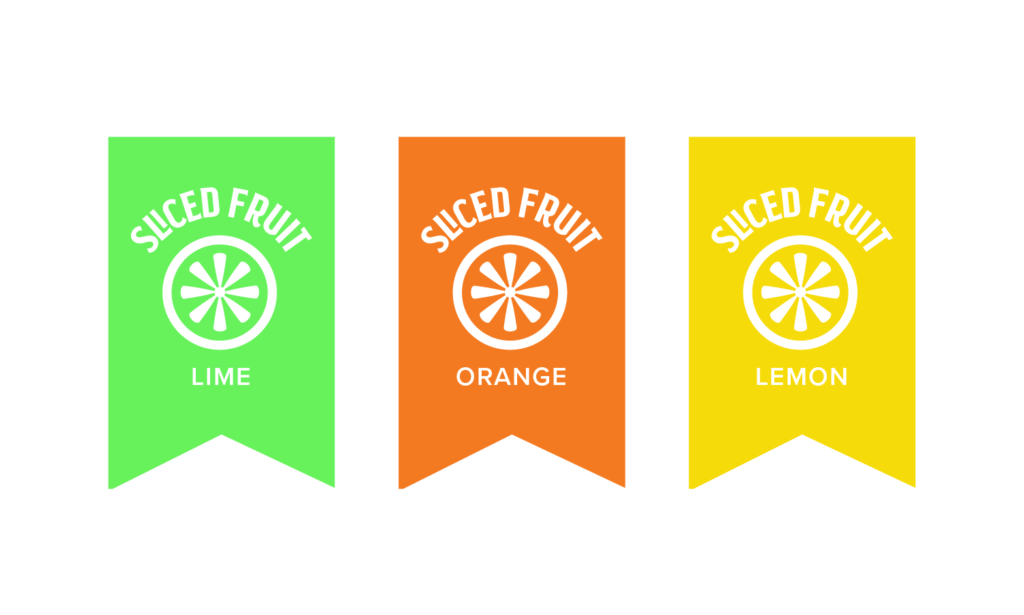
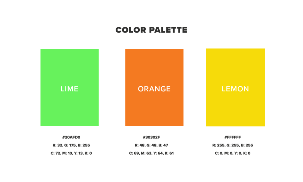
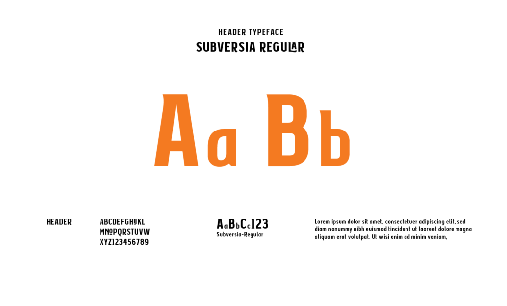
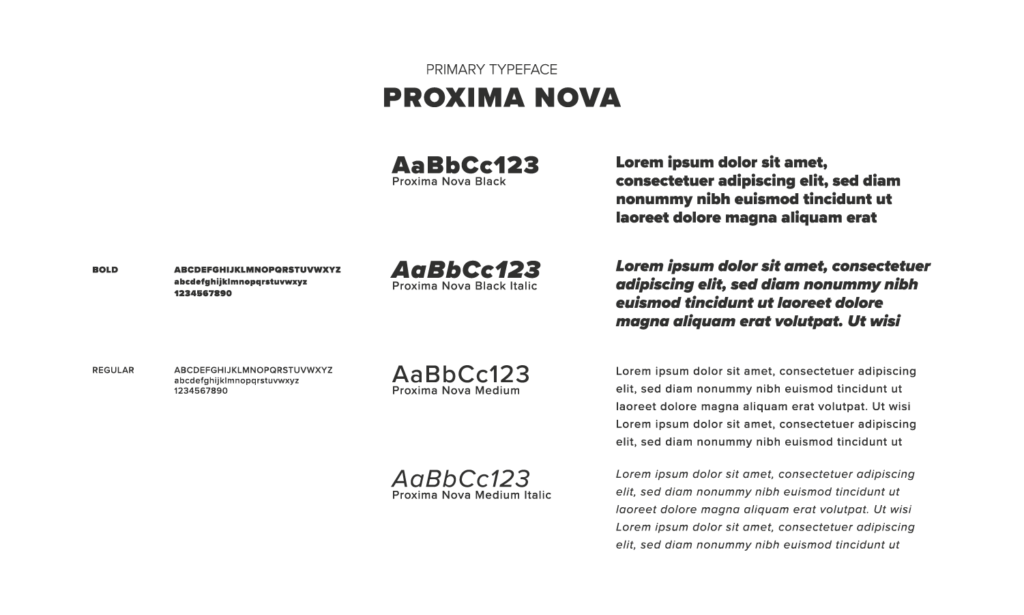
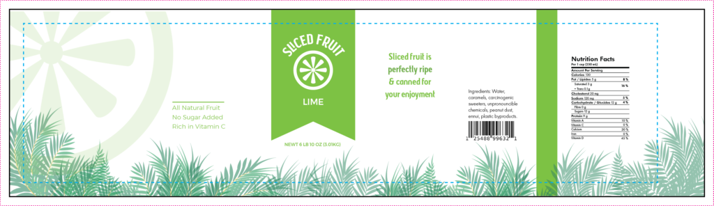
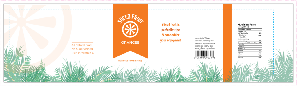
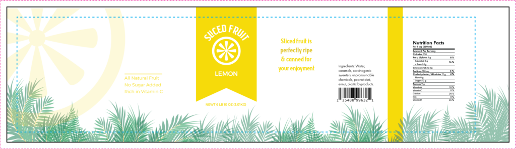
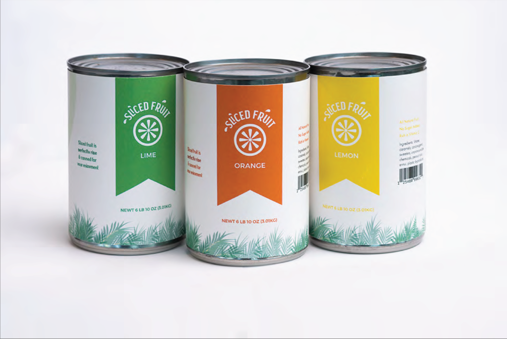
To make this brand stand out I played around with the use of simple nature elements, photography and clean colors.Together I think it creates a simple yet fun brand!
Nature Vector
Photography
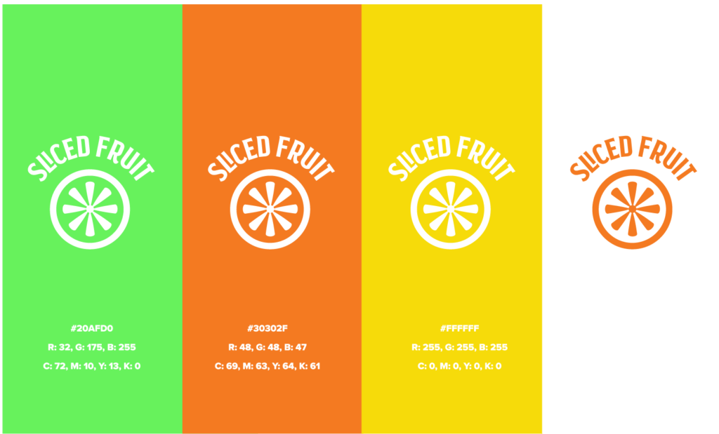
Color
Packaging
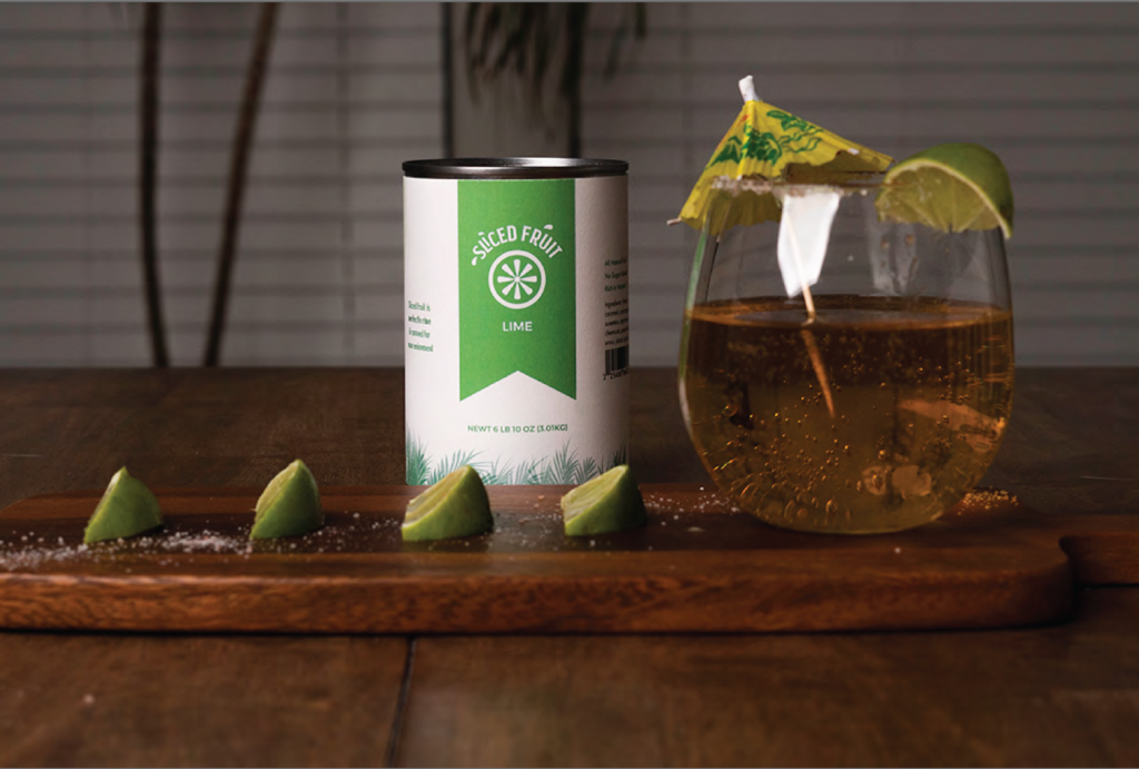
For the packaging I wanted the colors to resemble the fruit while keeping the plants at the bottom a consistent element of the design.
Photography
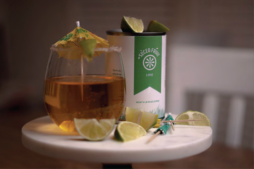
Along with my final design I felt like a group of product photography would push it further. I messed around with props and felt like the photos had a fun look to them!